

The polar regions are a unique playground for both scientists and artists. While the former test their hypotheses and theories with field data there, the latter are inspired to create works of art. And sometimes artists connect polar research to their work. But usually the research objects or the people are built in for this purpose. The project “Arctic Ice: A Visual Archive” takes a completely different approach, turning true data into art.
Satellite and drone-based data collection of iceberg migrations along Greenland’s west coast and thousands of measurements of sea ice thickness and mass using newly developed buoys with light sensors stuck into sea ice off the north coast of Alaska don’t sound like something art could evolve from. Rather, these would be important data to help researchers increase our understanding of what is happening in the Arctic and the effects of climate change. But Cy Keener, artist, designer and assistant professor at the University of Maryland and Justine Holzman, landscape researcher, designer and doctoral student at Princeton University created objects from it that combine art and science in a new way, making research data tangible and visible. This is not only to make science more tangible for the general public, but also to give climate change another face, full of beauty, yet dire in its effects.


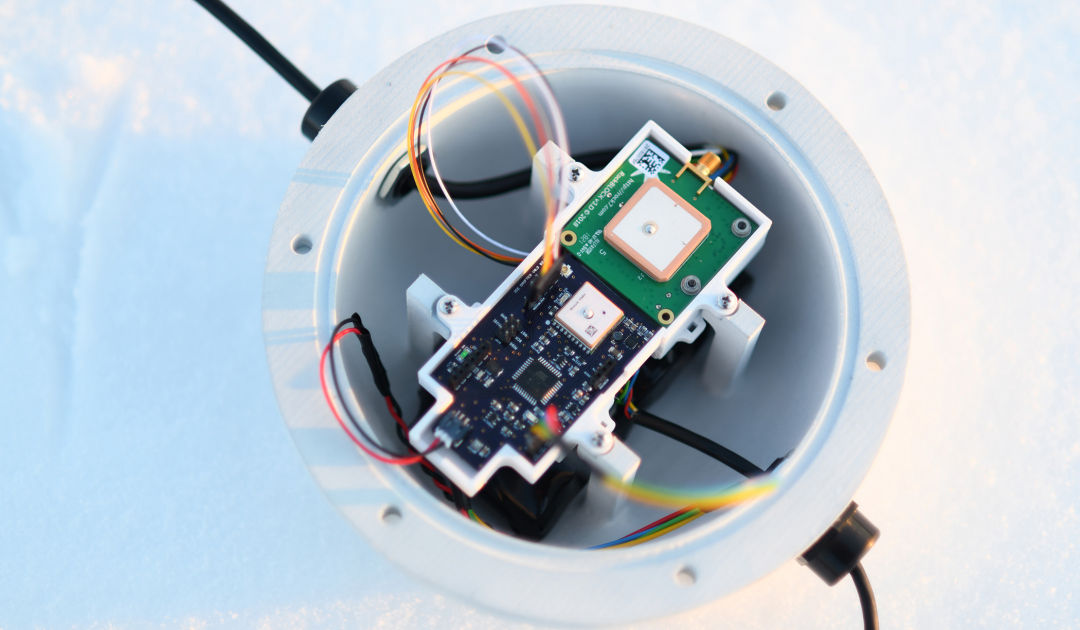
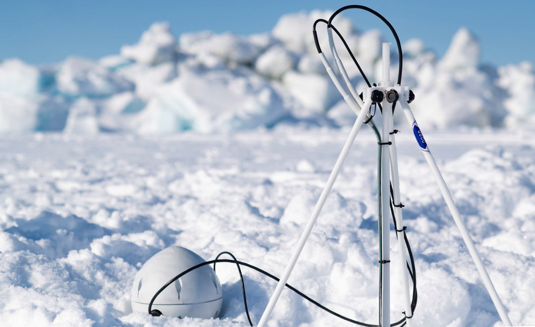
Working with University of Washington climatologist, sea ice physicist and assistant professor Ignatius Rigor and U.S. Navy International Engagement Office Deputy Chief John Woods, Cy Keener and Justine Holzman developed new instrumentation for data collection. These include the LIMB (Light and Ice mass Balance) buoy, which was deployed on the sea ice near Utqiagvik on the north coast of Alaska and measures sea ice thickness and density using a tape consisting of light, air pressure and temperature sensors developed in Croatia by Lovro Valcic, and sends the data to the researchers via an electronic board developed by Cy Keener himself and a satellite modem. These buoys were then deployed on the sea ice to form a network of data points. “The hull that protected the electronics of the LIMB buoy was so exquisite, I thought it was a crime to leave this instrument on the remote confines of sea ice to never be seen again,” Ignatius Rigor recalls.


The four team members teamed up again for a second project by Ignatius Rigor, which was to study the behavior of icebergs during melting processes. In the process, Keener and Holzman developed a satellite-based tracker that was dropped on icebergs by a drone and anchored itself in the ice with spider-like legs. Thus, the path of icebergs could be followed on the west coast of Greenland, in Disko Bay. This involved launching the drones from aboard a Danish coast guard vessel and dropping the trackers on icebergs. At the same time, the berg was accurately photographed and a 3D model was created, which also provided a more accurate picture of the size and mass of the icy colossus. The tracker remained on the iceberg until it toppled over, aided by the melting.


The data provided by both the LIMB buoys and the trackers on the icebergs and their images did not simply end up on the servers and hard drives of Ignatius Rigor and other research teams. Rather, Cy Keener and Justine Holzman used the data to, on the one hand, portray the icebergs on large images and show their fate. To do this, the images and data were combined into complex models and the missing areas below the waterline were added by hand drawing. “The hand drawing is purposefully vague and is intended to hint towards the necessarily approximate and imaginative efforts required to think through the dynamics of these everchanging landscapes of ice,” Justine Holzman comments. And Cy Keener adds, “In this exhibition we understand them as living things, falling apart in front of your eyes, constantly changing. We show their diversity and beauty.”
Keener and Holzman’s work uses science to inform their art, which in turn informs science, creating more questions and a cycle where engineering, art, and science interact to expand our knowledge.
Dr. Ignatius Rigor, Sea ice Physicist University of Washington
The artist and the designer also came up with something special for the approximately 27,000 sea ice measurement data: They mounted the individual data on acrylic plates around 180 centimeters high, backed with different colored paper. “We kept the scale 1:1 between the sea ice and the drawing,” Holzman says. This created whole rows of different layers and points. “These layers were meant to emphasize that each strip is just one point of data in a much larger repository and narrative about climate change.” The result is a series of artworks now on display at the National Academy of Sciences in the U.S. capital through February 2023 that seeks to raise public awareness about research, art and climate change. According to Ignatius Rigor, “Keener and Holzman’s work uses science to inform their art, which in turn informs science, creating more questions and a cycle where engineering, art, and science interact to expand our knowledge.”
Dr Michael Wenger, PolarJournal
More on the topic


We at Sea Research Society feel that there is no need to introduce ‘red herrings’ to the debate, art is art, it does no contribution to the facts. It is more like “preaching to the converted” than providing any new and much-needed persuasion to the ongoing debate – especially in the climate change skeptic US states in the south.
Instead of the lack art on the subject, the big problem is Arctic methane that is at tipping point. The second big problem is Arctic methane that seeded the ice ages air with geological carbon-12 which altered the proportion of carbon-14 by diluting. This makes warming and melting processes appear very long – which they were not. The oil and gas exploration lobby geologists have known it long time that 4.5 billion year old carbon in Arctic methane contains zero levels of carbon-14 and as it is prone to outgas methane by depressurisation, the Pleistocene injection diluted carbon-14 levels to a fraction of its occurrence at present-day environmental conditions. This all means that much more urgent action on carbon emissions are required otherwise it is just what Extinction Rebellion fears “too little, too late”. Generous grants by sponsors of extractive industries to geological training and geophysical expeditions keep people away from carbon isotope cycle studies relating to Arctic methane from Last Glacial Maximum (= Methane Clathrate Depressurisation Maximum) to Holocene Thermal Optimum (= Arctic Permafrost Melting Maximum).
Veli Albert Kallio, FRGS
Vice-President, Sea Research Society
Environmental Affairs Department
https://shipwrecks.com/srs/
Ethnoclimatologist (study of ethnic recollections about past
climates & palaeo-environments in world’s cultural heritage)
Chair at Frozen Isthmuses’ Protection Campaign of the Arctic and North Atlantic Oceans
campaigning for the near imminent loss of the Arctic Oceans’ sea ice cover since 2005.